Lab 2: Graphing Data
Lab 2: Graphing Data
The commonality between science and art is in trying to see profoundly - to develop strategies of seeing and showing. —Edward Tufte
When we measure things, we get lots of numbers. Too many. Sometimes so many your head explodes just thinking about them. One of the most helpful things you can do to begin to make sense of these numbers, is to look at them in graphical form.
Our general goals for this first lab are to get your feet wet, so to speak. We’ll do these things:
- Load in some data to jamovi
- Talk a little bit about how the data is structured
- Make graphs of the data so we can look at it and make sense of it.
Visualization is so important that we will continue to make graphs in subsequent labs.
The rest of this lab is divided into 3 main parts:
- Set up
- Describes the data we’ll be looking at
- Explains what a CSV file is
- Jamovi tutorial
- This part is long
- We’ll go over this together
- But I wrote it so that anyone can work on their own
- Marked exercises
- What you submit to get a grade
Set up
Sources of data for this lab
-
Data for employment is fake, automatically generated by a computer program that I wrote. The .csv file can be found here: employment data
-
Data for the ad groups (or identifiers) that Facebook sells to advertisers was obtained from ProPublica’s Data Store. The .csv file can be found here: facebook data
CSV file format
Data in our labs will be shared as CSV files. CSV stands for comma-separated values, and these types of files can be easily identified by the .csv file extension in their file name. Why CSV? It is one of the simplest file formats and most popular file formats for data. CSV files can be read by every computer application that involves data analysis: SPSS, Stata, Excel, Google Sheets, you name it. We’ll be doing all of our statistical analyses using the jamovi application and jamovi can also read .csv files. CSV files also have the advantage that you can also just look at them in a simple word processor.
So what’s in a CSV file? Here’s an example:
participant, stimulus, reaction_time
1, violent, 200
2, neutral, 500
The first thing is usually a row of headers, which are short descriptions of different variables. Each header is separated by a comma. In this example, there are 3 variables: participant, stimulus and reaction time. Each subsequent line is a row of values separated by commas. Looking at this, we can guess that participant 1 reacted very quickly to a violent stimulus, maybe the image of bloody knife. The next line suggests that participant 2 reacted more slowly to a neutral stimulus, perhaps the image of a computer. However, I am just guessing. Whoever made the CSV file should provide additional information to explain how these data were collected and what the different variables mean. This additional information is usually available in another file, like a website or PDF document for example. For our labs, I will describe each data file as much as is necessary for you to understand the required analyses. I will also provide links to additional information for those who are curious to learn more!
If you open up the above CSV file in a spreadsheet application like Excel, you might get something like this:
| participant | stimulus | reaction_time |
|---|---|---|
| 1 | violent | 200 |
| 2 | neutral | 500 |
Notice that data in a CSV file are tabular:
- each column represents a variable (described by its header)
- each row represents the values of an object for each variable
- in the example above, each object is a person
- the number of values in each row matches the number of variables (headers)
- in our example, 3 values for each person
- variable names should be informative
Jamovi has its own spreadsheet, as well as all the other stuff associated with statistical analysis software. So we’ll be doing all our work within jamovi.
Tutorial on jamovi, data cleaning and visualization
Get some data
Please download the employment and facebook data and save them somewhere on your computer. Preferably, these data will be in the same folder that you will save work for this lab. Now load the employment data into jamovi like this:
Employment data
This fake data lists employment status and gender for a sample of people from Wakanda.
"ID","gender","employment"
1,"male","full-time"
2,"male","full-time"
3,"male","part-time"
How many people are in this sample? And what are the different employment statuses? Try this on your own then click here for the answer.
We could simply look through the raw data. But counting can take a lot of time, and we would probably make mistakes. So we want the computer to do this stuff for us.
Main options in jamovi
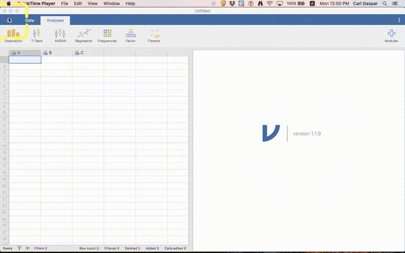
 In jamovi, you will be switching between 2 modes: Data and Analysis, corresponding to the 2 tabs in the image above. Data is the spreadsheet where you can see the raw data and do other things that you can do in a spreadsheet. Analysis is where you calculate statistics, make tables and make figures. The other mode, which you access by clicking on the 3 horizontal lines to the left of Data lets you open up new data and close existing data.
I might write something like:
Analysis > Exploration
This is an instruction to click on Exploration in Analysis mode.
Now many people in this sample?
Analyses > Exploration > Descriptives
In the left panel, put gender under “variables”. Using employment instead also works the same. In the right panel, you can now see that N = 400. In other words, we have 400 people in this data. However, we also have 91 people that appear to be Missing. What’s going on here? Let’s get back to this later.
Notice that there are some other things listed in our table that do not have values, like the mean. Only N (number of objects) and Missing (number of missing values) makes sense for our Nominal variables. So let’s get rid of these in our table. Everything that appears in our table is selected in the left panel under statistics. We can simply uncheck items that we do not want included, like mean.
Export APA table into Word
Are you doing your senior project now, or will be doing it in the near future? Chances are you’ll be including a table in your manuscript that is formatted according to APA guidelines. Well, we can just copy the table from jamovi into a Word document. Do this now! Notice that the copy of your table is not an image, but an actual table that you can edit!
What are the different employment statuses?
Data > Setup
Now click on the column header for employment (bottom panel) or simply shift left or right toward employment in the top panel. Now we can see all of the different employment statuses under levels in the top panel. What are they?
Now is a good time to discuss employment status. You might be wondering about the difference between unemployed and “not looking”. Unemployed people are currently out of work but trying to find work, whereas people who are not looking are simply not looking for work. Perhaps your wife is very rich and you can afford to spend all of your time playing video games? If that is you then technically you are not unemployed.
How many people are in the different employment categories?
To answer this question, let’s make our first graph. Just follow the procedure shown in this animation:
I will be making animations like this for some of our labs, especially the first few labs when you are still learning how to use jamovi. As we progress, you will be able to figure things out on your own.
Using a similar procedure as the one described for tables, you can copy this graph. Then you can paste it into Word for example. However, it might be good to export the graph as a separate file. This is what your graph should look like:

A similar graph using a different module
I chose jamovi instead of a similar application called JASP because it offers more options for visualization. Let’s explore some options in this lab.
Hopefully, you’ve installed the Flexplot module already.
Install the Flexplot module by doing the following:
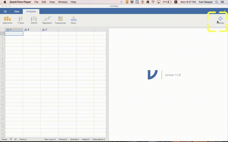
Once you have installed Flexplot, then just follow the procedure shown in this animation to make our alternate graph:
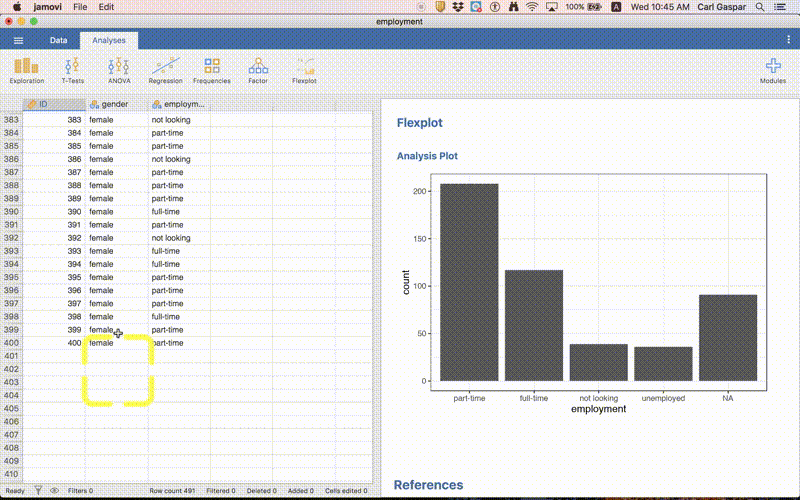
Here’s the resulting graph:

But what is this NA nonsense?
Graphs are really useful for identifying and illustrating patterns in your data. However, they are also useful for seeing if there is anything funny with your data! That’s what happened here! Clearly there is something funny going on. We already knew about this funny business earlier. But with more complicated data sets sometimes visualizing your data is the only way to spot funny business.
So what’s actually going on? Open up employment.csv in a simple word processor and scroll down to the end of the file. There you will see that there are 91 rows of commas without values, like this:
,,
,,
,,
,,
,,
We can also see this in the spreadsheet part of jamovi but you have to really know what you’re looking for:
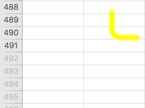
Notice that the row numbers are gray from row 492 onward. They should be gray from row 401 onward. That means jamovi thinks there are 91 people with completely missing data. Maybe there are. We would have to ask the person who collected these data!
Anyway, we have absolutely no data for these rows so let’s exclude them form all of our analyses. How do we do that?
Filtering out empty rows
Follow the procedure in this animation:
In words, clicked the Filters button under Data and typed the following as a ROW FILTER:
ROW() < 401
Then I hit the ENTER button. That’s it!
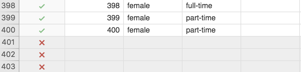
If you go the the spreadsheet part of jamovi you can see that there are now green check marks for all the rows included in analyses, and red x’s for all the rows excluded from analyses:
Finally, our graph has now been updated to reflect the exclusion of empty rows:

In other words, no more bar for NA!
The information about you that Facebook buys from marketing companies
According to ProPublica, our facebook data:
… contains data scraped from the company’s ad buying portal. This table shows what audiences Facebook allows ad buyers to target.
What does this mean?
Let’s start with the information.
Facebook was only just beginning to become popular when I was in graduate school. Now it is quite normal for people to have a facebook account. Apparently, facebook is the most popular social media platform in the UAE. So I’m going to just assume you know what facebook is.
And I imagine that you have at least a fuzzy idea that facebook makes money by selling information about you to advertisers.
But did you know how detailed this information can be?
The details
Here’s a few rows from the facebook data we’ll be looking at, with the headers at the top:
id,name,description,audience_size,type,source,partner,path
6003146077426,The Fast and the Furious,,64486580,interests,,,Interests/Additional interests/The Fast and the Furious
6003053857372,Away from family,People who are away from family,236154921,life_events,,,Demographics/Life events/Away from family
6019205389132,Independent Investors,"Households with people likely to have investible assets of $100,000 or more and validate investment decisions with a professional advisor",35143200,behaviors,"Modeled, provided by Acxiom",Acxiom,Behaviours/Financial/Investments/Independent Investors
6006521008625,Trendy moms,People whose activities strongly suggest they are trendy moms.,4784200,moms,"U.S consumer data on where consumers shop, how they shop, what products and brands they purchase, the publications they read, and their demographic and psychographic attributes.",DLX,Demographics/Parents/Mums/Trendy moms
Each row is a specific category of people that facebook can identify for advertisors. Imagine a company that sells protein powder for people who want to gain more muscle. This company thinks that people who are interested in the Fast & Furious movies also want to have large muscles. So they buy that information from facebook. Now this company knows which facebook users have an interest in the Fast & Furious movies and can target advertisements to them; maybe even offer them special deals or choose a model that looks like Vin Diesel.
Interest in “The Fast and the Furious” is one of the names listed in this data. There are thousands of other categories (names) listed under the type interests, like “Arsenal F.C.” and “Kim Kardashian”.
Yes, facebook can tell if you are away from your family and will sell this info about you to advertisers.
| name | type | partner |
|---|---|---|
| The Fast and the Furious | interests | |
| Away from family | life_events | |
| Independent Investors | behaviors | Acxiom |
| Trendy moms | mom | DLX |
Information from data brokers
But you may not be aware that facebook also buys information about you from special companies called data brokers.
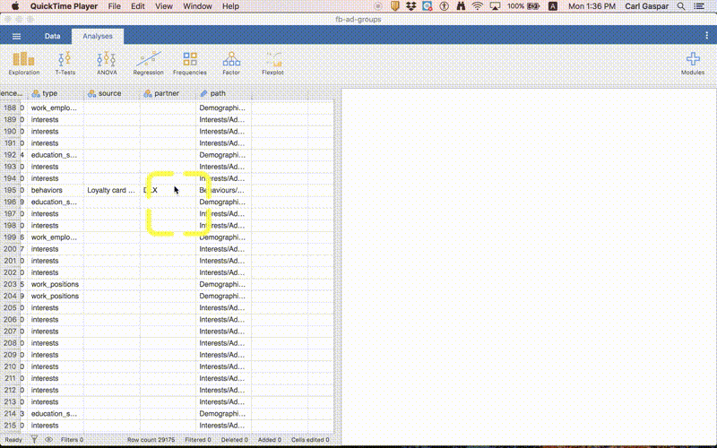
In other words, facebook has access to information about you that is collected outside of what is in your facebook account. Clicking third-party pages and ads in facebook counts; that info must be bought by facebook from the advertisers. But there are other sources, like when you sign up for a loyalty card at a coffee shop for example. Or public records of car ownership (in some countries).
Altogether, the info facebook has about you can be surprisingly detailed. ProPublica wanted to know about the information that facebook buys from data brokers, so they simply went to the website where facebook sells information about you to advertisers.
Filtering out unknown companies
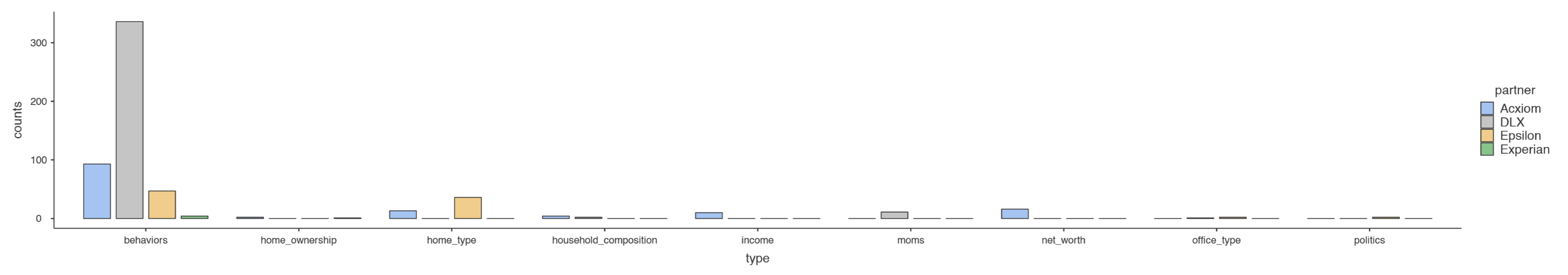
Types by different companies
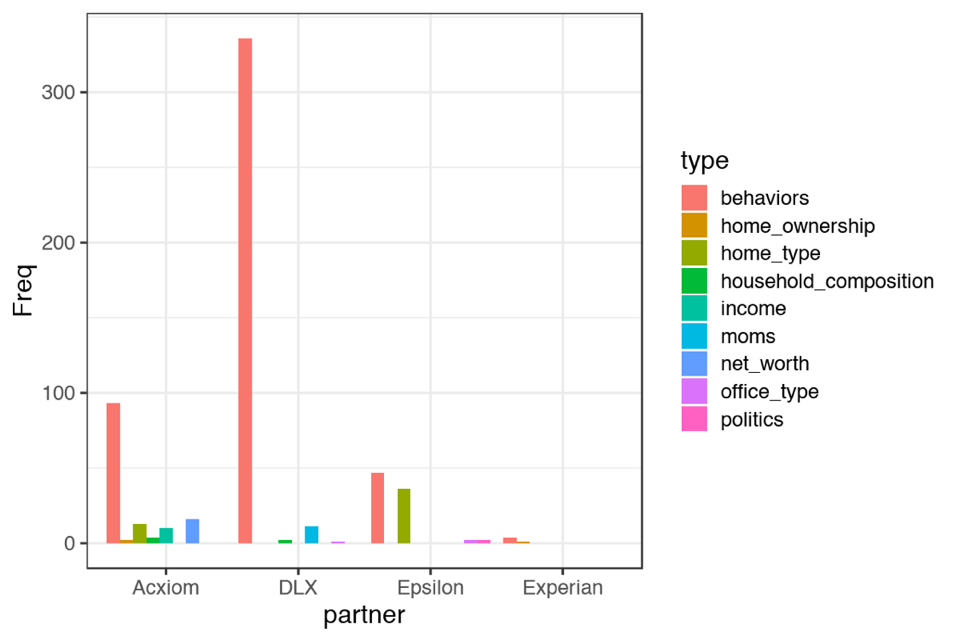 Let’s refer to this graph as type-by-company.
Companies by different types
This graph is very large so click here to view this figure in its own webpage.
Let’s refer to this graph as company-by-type.
Marked exercises (5 points total)
5 questions, 1 point each.
Question 1 requires you to upload a jamovi file.
Write your answers for questions 2 to 5 in a single text document (like Word) and upload that.
Upload both your jamovi file and text (Word) document to:
Instructor's Assessments > Lab 2
Question 1 (1 point)
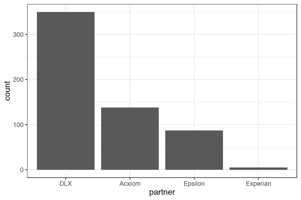
The last graph we made (company-by-type) compared companies for each of the different types of identifier. Suppose that the only identifier type we care about is behaviors. We want a simpler graph that looks like this:
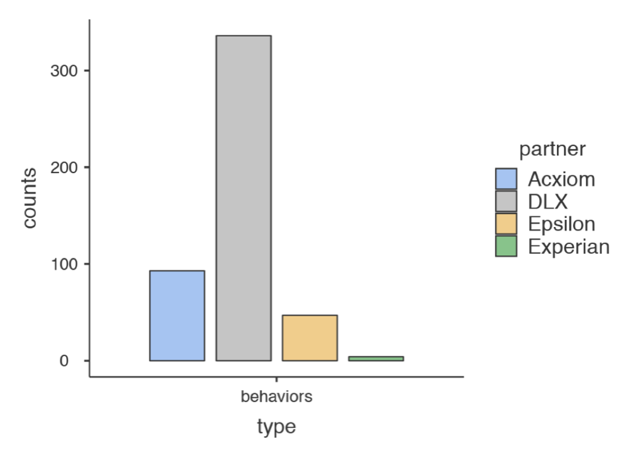
Please recreate this graph.
HINT: You can use filtering.
Once you have made this graph, save your work as a jamovi file:
Question 2 (1 point)
Which company sells the most diverse range of identifier types?
Question 3 (1 point)
Which of these 2 graphs is most appropriate for answering the previous question? type-by-company or company-by-type?
Question 4 (1 point)
Which company provides the most information about different types of moms?
Question 5 (1 point)
Which of these 2 graphs is most appropriate for answering the previous question? type-by-company or company-by-type?
Rubric
General grading.
- You will receive 0 points for missing answers (say, if you do not answer question 2, then you will receive 0 for that question)
- Question 1 requires you to upload a jamovi file that shows the requested figure. If you upload an image instead you will receive 0.